

Compliance comes first, then protection, then conversion. Get the Supplement Facts panel and required label elements locked into your dieline before you touch typography or color, because retrofitting compliance into a finished layout is how brands end up paying for a second print run. Everything else, from material choice to shelf appeal, has to work around that fixed footprint.
TL;DR:
- Ensuring compliance with label elements and the Supplement Facts panel before finalizing design avoids costly reprints and fits within a fixed footprint.
- Choosing the right container format depends on product type, with options like capsules, powders, gummies, and single-dose packets each offering specific benefits and challenges.
- Design should prioritize the brand identity, product name, and key benefit in three fixed zones on the front panel to maximize shelf impact and readability.
- Labeling must meet regulatory requirements for ingredients, disclosures, and packaging, especially for products with elemental iron or allergens, to prevent violations.
- Packaging materials should match ingredient sensitivity, with opaque bottles for light-sensitive actives and barrier films for moisture-sensitive formulas, considering sustainability trade-offs.
Table of Contents
- What Are the Best Container Formats for Supplement Packaging Design?
- How Should You Structure the Front Panel for Maximum Shelf Impact?
- What Labeling Rules Are Required for Supplement Packaging?
- Which Materials Protect Formula Stability Best?
- Does Your Sales Channel Change Your Packaging Requirements?
- What Packaging Trends Should You Actually Adopt in 2026?
- How Formlypro Connects Formulation, Compliance, and Packaging Design
- Get Packaging-Ready Artwork Without the Redesign Cycle
- Why Compliance-First Design Beats Aesthetics-First Every Time
- Sources
What Are the Best Container Formats for Supplement Packaging Design?
Format choice drives everything downstream, from tooling cost to how a product photographs on a retail shelf. Here's how the common options stack up:
- Capsule and tablet bottles. The default for a reason: rigid HDPE or PET bottles protect against moisture, stack well for shipping, and give you a large front panel for branding. Downside: higher per-unit cost than flexible formats at low volumes.
- Powder tubs. Wide-mouth tubs work for protein and greens powders where scoopability matters. Windowed lids let shoppers see product color and texture, which builds trust before purchase.
- Gummy pouches. Flexible, lightweight, and cheap to ship, but they need strong barrier film to keep gummies from drying out or clumping.
- Stick packs and sachets. Ideal for single-dose, on-the-go positioning. They're also the cheapest way to test a new SKU without committing to bottle tooling.
- Blister packs. Common for daily-dose vitamins where portion control and tamper evidence matter more than shelf drama.
- Tins. Underused in supplements but effective for premium or limited-run positioning, especially with embossed lids.
Color-coded SKU systems (matching cap color to flavor or formulation) help repeat buyers grab the right product fast, both online and in a store aisle. If you're testing multiple formats before committing to a production run, check what your minimum order quantity actually requires. Formlypro's product concept visualization tools let you preview several formats before a single mold gets cut.
How Should You Structure the Front Panel for Maximum Shelf Impact?
Shoppers scan a label in seconds, often deciding based on brand, product name, and hero benefit before reading anything else. That's the order your front panel needs to follow, not brand followed by a paragraph of ingredient claims.
Build your layout in three fixed zones: brand identity at the top, product name in the middle, and the single strongest benefit claim below it. Everything else, certifications, flavor, dosage count, moves to secondary real estate. For online sales, design for the thumbnail first. If your product name and benefit aren't legible at 300 pixels wide, you're losing conversions before a shopper ever reaches the product page.
Type size matters more than most designers assume. The Supplement Facts panel has minimum font requirements that don't flex for design preference, so reserving that footprint in your dieline before you finalize the front panel saves a redesign later.
- Soft-touch laminate signals premium positioning, especially for sports nutrition and wellness lines.
- Foil stamping draws the eye to a logo or claim without adding print cost across the whole panel.
- Embossing works well on tins and rigid boxes but adds tooling time, so budget extra lead time.
Pro Tip: Sketch your Supplement Facts box as a fixed rectangle in your dieline file before you design anything else on the panel. Every layout decision after that should work around it, not the other way around.
What Labeling Rules Are Required for Supplement Packaging?
Misbranding is the fastest way to trigger a costly recall, and most violations come from skipping formatting rules rather than omitting content entirely. Here's the checklist to run before artwork goes to print:
- Supplement Facts panel with all required nutrients, serving size, and percent daily values.
- Statement of identity naming the product type clearly (for example, "Dietary Supplement").
- Net quantity of contents in both metric and U.S. customary units.
- Complete ingredient list, including "other ingredients" like fillers and coatings.
- Manufacturer, packer, or distributor contact information, including a physical address.
The FDA Dietary Supplement Labeling Guide spells out minimum font sizes and a required boxed layout for the Supplement Facts panel, and any structure or function claim needs the standard DSHEA disclaimer stating the FDA hasn't evaluated the claim and the product isn't intended to diagnose, treat, cure, or prevent disease.
Watch for these traps early: products containing elemental iron above regulatory thresholds require Child-Resistant Packaging, a structural requirement that gets tested for performance, not just claimed on the label. Allergen declarations need to match your actual formulation, not a template from a prior SKU. And any wording that edges toward a disease claim (think "reduces inflammation" instead of "supports joint comfort") can trigger regulatory action fast. Formlypro's compliance requirements checklist walks through these line by line before you finalize copy.

Which Materials Protect Formula Stability Best?
Your ingredient's sensitivity should decide your container material, not the other way around. Light-sensitive actives like probiotics and certain vitamins need amber or fully opaque bottles. Moisture-sensitive powders need high-barrier film and often a desiccant packet inside the container to stay shelf-stable.
- Induction seals prevent tampering and slow oxygen exposure after the first open.
- Barrier films (foil-laminated pouches, for instance) block oxygen and moisture better than single-layer plastic but are harder to recycle.
- Desiccants extend shelf life for capsules and powders but add a line item to your unit cost.
- Child-Resistant closures are mandatory once elemental iron content crosses the regulatory threshold, and they need to be built into tooling from the start, not bolted on later.
Recyclable mono-material packaging is gaining ground, but it usually trades off some barrier performance. If your formula is highly oxygen-sensitive, that trade-off might not be worth the sustainability marketing win. Formlypro's food chemist packaging guidance covers how to match container choice to formula chemistry before you commit to tooling.
Does Your Sales Channel Change Your Packaging Requirements?
Yes, and ignoring this is one of the most common causes of last-minute rework. Each channel has its own rules:
- Amazon and FBA: barcode placement and scannability matter for warehouse processing, and loose products often require poly-bagging with a suffocation warning printed on the bag.
- Retail: your packaging needs to read clearly from three or four feet away, and SKU architecture (color, shape, panel layout) needs to stay consistent across your whole line so shoppers can spot your brand fast.
- DTC: unboxing experience matters more, and if you run a subscription model, your packaging needs to survive repeated shipping without denting or crushing.
Pro Tip: Run a short-run proof, even just 50 to 100 units, before committing to a full print order. It's the cheapest insurance against discovering a structural flaw after your first pallet ships.
What Packaging Trends Should You Actually Adopt in 2026?
Not every trend deserves your production budget. Minimalist, lab-grade aesthetics work well for premium DTC and sports nutrition brands trying to signal scientific credibility, as seen in case studies where brands lean on clean typography and restrained color to feel more clinical than commercial.
- Circular biomaterials appeal to sustainability-focused buyers but often cost more per unit.
- Micro-portable formats (single-serve sachets, travel tins) fit sports nutrition and on-the-go wellness brands well.
- Tactile finishes like soft-touch coatings signal premium positioning at mass retail price points.
- Current packaging trends also point toward low-cost smart cues like QR codes linking to sourcing stories, which cost little to add and give DTC brands another trust signal.
Test finishes with digital mockups or small proof runs before you commit to full tooling costs.
How Formlypro Connects Formulation, Compliance, and Packaging Design
Packaging decisions made in isolation from formulation data are how brands end up redesigning labels after a compliance review flags a problem. Formlypro's 8-phase workflow builds packaging into the process from ideation through production, not as an afterthought once the formula is locked.
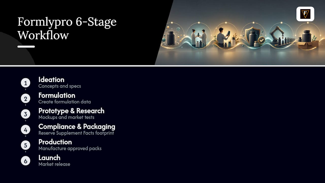
The AI mockup designer reserves your Supplement Facts panel footprint automatically based on your actual formulation data, so you're not guessing at font sizing or box dimensions before compliance review...
Get Packaging-Ready Artwork Without the Redesign Cycle
Formlypro is the alternative to juggling a formulator, a compliance consultant, and a freelance designer separately. It ties your formulation data, compliance checks, and packaging mockups into one workflow, so your Supplement Facts panel, ingredient list, and front-panel design stay in sync from day one instead of getting reconciled after the fact.
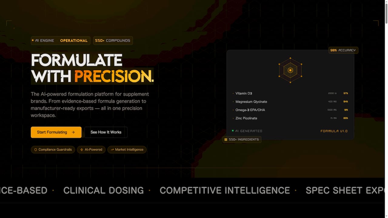
That matters most when you're racing toward a print deadline. Formlypro generates manufacturer-ready artwork exports directly from your formulation data, which means fewer rounds of back-and-forth with your printer over dieline errors or missing compliance elements.
| What you get | Why it matters |
|---|---|
| Compliance checks tied to formulation | Fewer reprints from missed FDA requirements |
| AI mockup exports (front, angle, flat lay) | Skip multiple design revision rounds |
| Manufacturer-ready dielines | Faster handoff to your printer or co-packer |
Start a project on the Formlypro platform to see how your formulation data turns into packaging-ready artwork.
Why Compliance-First Design Beats Aesthetics-First Every Time
Most packaging failures I've seen traced back to one decision: designing the pretty parts before the mandatory parts. A brand falls in love with a bottle shape or a color palette, builds the whole visual identity around it, then discovers the Supplement Facts panel doesn't fit without shrinking the logo or trimming a benefit claim they'd already promised retail buyers.
The fix isn't complicated, but it's unpopular because it feels backward to creative teams. Lock the compliance footprint first. Build your brand story into whatever real estate is left. That's not a limitation on good design, it's the actual constraint every successful supplement label works within, whether the designer admits it or not.
Where brands get this wrong most often is assuming compliance and conversion are in tension. They're not. A clean, boxed Supplement Facts panel next to a confident hero benefit claim reads as more trustworthy than a cluttered label trying to say everything at once. The best packaging treats regulatory structure as a design feature, not an obstacle to hide.
— Ben
Sources
The FDA Dietary Supplement Labeling Guide sets the mandatory label requirements referenced throughout this piece. For labeling rules beyond supplements, see this federal and state labeling checklist. Ingredient-specific labeling questions, including for peptide products, follow similar disclosure principles.
This article is general information, not a substitute for advice from a qualified doctor. Consult a qualified healthcare professional about your own circumstances before acting on anything here.
- Dietary Supplement Labeling Guide — FDA
- US Supplement Packaging Guide: Design, Compliance & Logistics - Zenpack Blog
- Supplement Label & Mockup Design: A Practical Guide — Helion360
- 2026 global supplement packaging trends — Otarapack