
TL;DR:
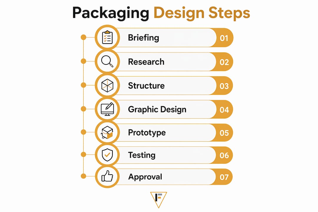
- Effective packaging design requires a clear, detailed brief that aligns structural and visual goals from the outset. Locking structure early, testing prototypes thoroughly, and conducting user feedback prevent costly revisions and ensure brand promises are delivered. A disciplined, sequential process with integrated testing and stakeholder approval leads to successful product presentation and market impact.
Packaging is a sales tool. It's also a quality signal, a logistics problem, and a brand promise all compressed into a single physical object. Yet most first-time product developers treat it as an afterthought, which is exactly why so many products fail on the shelf before a single customer reaches for them. Knowing how to design packaging the right way means following a professional-grade process: from a precise brief through structure selection, graphic design, and physical testing. This guide gives you that process, step by step.
Key Takeaways
| Point | Details |
|---|---|
| Start with a written brief | Locking goals, dimensions, and budget upfront prevents wasted design iterations later. |
| Lock structure before graphics | Confirming your dieline early stops expensive redesigns once visual work has started. |
| Design for legibility first | Color and typography must communicate clearly before they can communicate beautifully. |
| Test with real printed samples | Physical mockups reveal usability and brand issues that digital screens consistently hide. |
| Build a formal review cadence | Designating reviewer roles and file lock dates removes the most common production bottleneck. |
How to design packaging: start with a solid brief
Before a single color is chosen or a box style is picked, you need a written brief. This document is not a formality. It is the foundation every decision gets built on, and skipping it is the single most reliable way to burn budget on revisions.
Your brief should answer five core questions:
- What does the packaging need to do? Protection, branding, regulatory compliance, retail display, and e-commerce shipping are all separate requirements that may conflict with one another.
- What are the exact product dimensions and weight? Inaccurate measurements are the leading cause of design delays and late-stage revisions.
- Where will it be sold? Retail shelf packaging and direct-to-consumer shipping boxes have completely different structural and visual requirements.
- Who is the customer? The unboxing experience for a premium supplement brand looks nothing like the quick-open design needed for a grocery product.
- What is the budget and timeline? Specialty finishes and premium materials require longer lead times and minimum order quantities.
Walk your team through category and shelf research before the design process begins. Visit stores where competing products sit. Photograph what pulls your eye and what disappears into visual noise. This isn't inspiration gathering. It is competitive intelligence.
Pro Tip: Include a "what we are not" column in your brief alongside "what we are." Defining what the brand should never look or feel like is just as useful to a designer as describing the brand vision.

Selecting structure, materials, and box style
Structure comes before graphics. Always. Locking packaging format early reduces waste, improves shipping efficiency, and prevents the painful scenario where finished artwork has to be completely reworked to fit a dieline change.
Here is a practical sequence for structural decisions:
- Choose your packaging category. Folding carton, rigid box, flexible pouch, tube, and clamshell all serve different products and price points. A supplement capsule product and a protein powder have fundamentally different structural needs.
- Request dielines from your printer early. Printer-provided dielines are non-negotiable before any graphic design begins. Structure decisions directly constrain what graphic and finishing options are available.
- Select your substrate. Paperboard weight, corrugated flute size, and kraft stock each affect durability, printability, and perceived quality. A heavier board stock signals premium; a lighter one signals value.
- Consider finishing options. Matte or gloss laminate, spot UV coating, foil stamping, and embossing all change the tactile and visual experience. Tactile finishes like embossing measurably improve consumer perception and brand engagement.
- Validate against your budget. Specialty finishes add cost and lead time. Know your constraints before you fall in love with a treatment you can't afford.
Here is how common box styles compare for typical product categories:
| Box style | Best for | Key tradeoff |
|---|---|---|
| Tuck-end folding carton | Supplements, cosmetics, food | Cost-effective but limited structural rigidity |
| Rigid setup box | Premium gifting, electronics | High perceived value, higher unit cost |
| Mailer box | E-commerce, subscription brands | Dual-purpose shipping and brand display |
| Sleeve and tray | Retail food, personal care | Strong shelf presence, complex assembly |
| Flexible pouch | Powders, snacks, liquids | Lightweight and low-cost, less premium feel |
Pro Tip: Ask your printer for a plain structural sample before any artwork is placed. Folding it, filling it with a product stand-in, and stacking several units will reveal fit and durability problems that flat dielines never show.
Developing the graphic design and preparing print files
With a confirmed structure and dieline in hand, graphic design can begin in earnest. The packaging design process at this stage breaks into two parallel tracks: visual development and technical file preparation.
On the visual side, every graphic choice must serve two masters: the brand and the buyer.
- Color palette. Colors must differentiate you on shelf and align with brand standards. They also need to reproduce accurately in CMYK. What looks vivid on screen can print flat.
- Typography. Hierarchy matters enormously. The product name, variant, key benefit, and net weight all need to read at different distances and in different lighting conditions. Never sacrifice legibility for style.
- Imagery. Photography or illustration should communicate product benefit at a glance. On a 3-inch panel, complexity loses every time.
- Regulatory information. Supplement facts panels, ingredient lists, and claims all have mandatory placement and sizing rules. Build them in from the start, not as a last-minute addition.
Develop at least two to three distinct concept directions before committing. Printing thumbnail mockups and taping them to actual product samples gives you far more useful feedback than reviewing on a monitor.
On the technical side, printers have specific requirements that must be met to avoid production failures:
| File specification | Required standard |
|---|---|
| Color mode | CMYK (not RGB) |
| Image resolution | Minimum 300 dpi at final print size |
| Dieline placement | Separate, locked layer in the file |
| Bleed | Minimum 0.125 inches beyond trim edge |
| Safe zone | Critical content at least 0.125 inches inside trim |
| File format | Print-ready PDF or layered AI/EPS |
Multiple SKUs require individual print files. Building a naming convention and file management system from day one saves significant time when your line grows.
Pro Tip: Set your document color profile to the specific printing standard your printer uses, such as US Web Coated SWOP, before you start building artwork. Correcting this after design is done causes color shifts that require full artwork review.
Prototype, test, and get final approval
Prototyping is not optional. It is the stage where your design meets reality, and reality frequently has notes.
Follow this sequence before committing to a production run:
- Order a structural prototype. This is an unprinted or digitally printed version of your exact dieline, folded and assembled. Fill it with your actual product and test stacking, opening, resealing if applicable, and drop durability.
- Order a color proof. A press proof or calibrated digital proof shows how your specific inks and substrate will interact. Expect color to look different from your monitor. Adjust before mass production, not after.
- Conduct user testing. Testing after printing is a distinct checkpoint beyond design reviews. Ask real people to find the opening, read the key benefit, and locate the ingredient list under typical retail lighting. This stage consistently catches legibility and UX problems that internal teams overlook because they already know where everything is.
- Review for compliance. Confirm that all required label claims, warnings, and certifications are present, correctly sized, and placed per applicable regulations. For health and wellness brands, this step is especially high-stakes. A compliance requirements list specific to your product category is worth building before this stage.
- Lock and approve. Run a formal final review with every stakeholder who has authority to halt production. Assign clear reviewer roles and a hard file-lock date. A managed approval cadence is the single most effective way to eliminate the delays that cluster at the end of the packaging pipeline.
The goal of this entire sequence is to uncover problems when fixing them costs hours, not weeks. A single late-stage structural change can cascade into artwork revisions, compliance re-reviews, and shipping delays that eat into your launch window.
My honest take on packaging design
I've reviewed a lot of packaging projects across formulation-forward brands, and the pattern that causes the most pain is almost always the same: teams treat structure and graphics as parallel tracks instead of sequential ones. They brief a designer before the dieline is confirmed, the designer builds beautiful artwork, and then the printer confirms a different box dimension. Everything shifts. Everyone is annoyed. Three weeks disappear.
The other thing I've seen consistently undervalued is user testing after print. Most teams do one round of internal review, declare it approved, and go to production. Then a customer posts a video of herself unable to find the serving size, or struggling to open a sealed pouch without tearing the entire panel. That feedback is now public and permanent.
What I've learned from watching brands go through this process multiple times is that the packaging design process rewards discipline far more than creativity. The creative work matters enormously. But creativity without structure just produces beautiful mistakes. When the brief is tight, the dieline is locked early, and testing is treated as a genuine quality gate rather than a rubber stamp, the creative work lands better because it's pointed at the right target from the beginning. Packaging is the first physical thing your customer touches. It tells them whether your brand keeps its promises before they've opened the box.
— Ben
How Formlypro makes packaging less overwhelming
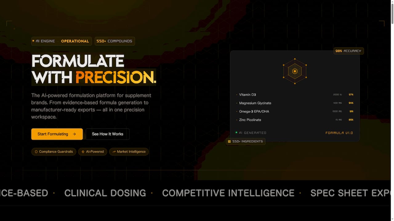
If you've made it through this process mentally and the number of decisions feels daunting, that's because it genuinely is a lot to manage without a system. Formlypro is built to take exactly this kind of complexity off your plate. The platform includes an AI Mockup Designer that lets you build and visualize custom packaging directly within your product workflow, alongside your formulation, compliance requirements, and market positioning data. Instead of managing a brief in one document, a dieline in another, and a compliance checklist in a third, everything lives in one place. You can learn more about building custom packaging within a structured product development system, or explore the full Formlypro platform to see how it manages packaging alongside every other phase of bringing a product to market.
FAQ
What is the first step in the packaging design process?
Start with a written brief that captures product dimensions, sales channel, customer profile, and budget. A precise brief prevents wasted iterations and keeps structural and graphic decisions aligned from the start.
Why does structure need to be finalized before graphic design?
Structure decisions constrain which graphic layouts, panel sizes, and finishing options are possible. Starting artwork before the dieline is confirmed almost always results in costly revisions when the two don't align.
What file format do printers require for packaging artwork?
Printers typically require print-ready PDFs or layered AI/EPS files in CMYK color mode, with images at 300 dpi, dielines on a separate layer, and at least 0.125 inches of bleed beyond the trim edge.
How important is user testing in packaging design?
User testing post-print is one of the most skipped but highest-value steps in the process. It validates whether real customers can read, open, and interact with your packaging the way you intended.
What is a packaging dieline?
A dieline is a flat, two-dimensional template that shows exactly where a package will be cut, folded, and scored. Confirming the dieline with your printer before artwork begins is the most effective way to prevent expensive late-stage redesigns.