
TL;DR:
- Packaging UX encompasses consumer interactions with a product’s container, influencing satisfaction and loyalty. Critical factors include ease of opening, protection, visual clarity, and sustainability, all of which shape brand perception and customer experience. Testing real-world usability and integrating sustainability from the start enhance brand reputation, loyalty, and revenue.
User experience in packaging is defined as the totality of how a consumer interacts with a product's packaging, from first touch through disposal, encompassing protection, usability, visual clarity, and emotional response. Packaging is often the first physical brand interaction a customer has, particularly in e-commerce, which makes it a decisive moment for satisfaction and loyalty. A 2026 survey of 6,000 consumers found that two-thirds link packaging UX to repeat purchases. That single statistic reframes packaging from a cost line to a revenue driver. Brands and product developers who treat packaging as a UX discipline, not just a container decision, consistently outperform those who don't.
How does packaging function influence user experience and customer perception?
Functional packaging design, known in human factors research as packaging usability, is the foundation of the entire customer experience. Before a consumer reads a label or admires the aesthetics, they need to open the product without frustration. That sounds basic. The data says most brands are failing at it.
A survey of 1,000 U.S. adults found that 78.8% frequently need a tool to open packaging. That means nearly four out of five customers are reaching for scissors before they reach your product. The same study found that 70.6% associate frustrating packaging with negative brand perceptions, specifically that the brand is cheap or doesn't care about its customers. Packaging frustration doesn't stay contained to the moment. It transfers directly onto the brand.
The functional dimensions that most directly affect consumer perception include:
- Protection: 98% of consumers view packaging protection as non-negotiable. Damaged products generate returns, negative reviews, and lost trust.
- Ease of opening: Tear strips, perforations, and pull tabs that actually work reduce friction at the most critical moment of product interaction.
- Resealability: For food, supplements, and personal care products, resealable packaging signals quality and extends product life, both of which consumers associate with brand care.
- Inclusive design: AeroFlexx flexible liquid packaging earned the Arthritis Foundation's Ease of Use Certification after human-factors testing confirmed reduced joint strain and easier opening. Designing for users with physical limitations improves the experience for everyone.
The Arthritis Foundation certification example matters beyond its niche. Inclusive packaging validated through human-factors testing benefits all consumers, not just those with specific needs. A cap that's easier for someone with arthritis is also easier for someone holding a phone in their other hand.
Pro Tip: Test your packaging in realistic conditions, not just a clean lab environment. One-handed use, low-light settings, and wet hands reveal friction points that standard QA testing misses entirely.
What is the impact of visual design and information clarity on packaging UX?
Visual design in packaging operates on two levels simultaneously: emotional engagement and cognitive processing. Both matter, and they require different design decisions. Conflating them is one of the most common mistakes brands make when evaluating the impact of design on user experience.
Eye-tracking research shows that transparent packaging windows significantly increase consumer visual attention, perceived quality, and purchase intention compared to product-image packaging. Seeing the actual product removes uncertainty and builds trust in a way that even high-quality photography cannot replicate. For supplements, food products, and beauty items, this is a direct conversion lever.
Visual hierarchy determines what consumers process first, second, and third. Placing your most critical information, whether that's a health claim, a usage instruction, or a traceability code, in the central "hot zones" of a package face increases both attention and comprehension. But prominence alone is not enough. Research confirms that label readability requires meeting perceptual thresholds. A bold headline that fails minimum contrast or font-size standards will be noticed but not read. Noticed and understood are not the same thing.
Here is how visual design elements compare in their effect on consumer comprehension and trust:
| Design Element | Effect on Comprehension | Effect on Trust |
|---|---|---|
| Transparent window | High: confirms product contents | High: removes uncertainty |
| Readable label hierarchy | High: guides attention to key claims | Moderate: signals professionalism |
| Color-coded information zones | Moderate: speeds category recognition | Moderate: creates visual order |
| Dense text blocks | Low: increases cognitive load | Low: perceived as confusing |
| QR codes with clear call to action | Moderate: extends information access | High: signals brand transparency |
Processing fluency, the ease with which the brain processes visual information, directly enhances emotional response and trust. Packaging that is visually clean and logically organized feels more credible, even before the consumer reads a single word. This is why visual processing fluency should be treated as a design requirement, not a stylistic preference.
Pro Tip: Run your label through a contrast-checker tool and print it at actual size before finalizing. Designs that look sharp on screen frequently fail readability thresholds in physical form.
How does packaging sustainability affect user experience and brand perception?
Sustainability and usability are not competing priorities. Consumers expect both, and the data makes that expectation concrete. The Mondi 2026 eCommerce Trend Report found that 86% of consumers expect sustainability from packaging alongside protection and usability. That is not a niche preference. It is a baseline expectation that, when unmet, damages brand perception.
Amazon's 2026 approach to packaging illustrates what integrated sustainability looks like in practice. The company uses AI to optimize packaging size and material selection, minimizing waste while maintaining damage-free delivery. The operational logic is that right-sized packaging reduces material costs, lowers shipping weight, and improves the unboxing experience by eliminating the frustration of excessive void fill. Sustainability and user satisfaction point in the same direction when the design process treats them as a single system.
For brands building packaging from the ground up, the integration process works best when structured in sequence:
- Define UX requirements first. Identify the opening mechanism, resealability needs, and protection standards before selecting materials.
- Evaluate sustainable material options against those requirements. Lightweight, recyclable materials often meet functional needs while reducing environmental impact.
- Model the logistics impact. Packaging that performs well in a lab but collapses under fulfillment conditions creates returns, waste, and negative reviews.
- Test with real users before production. Consumer feedback on sustainable packaging often surfaces usability issues that internal teams overlook.
- Align cross-functional teams early. Integrated packaging design requires UX, operations, sustainability, and quality assurance working from the same brief, not in sequence.
The brands that treat sustainability as an afterthought, layering it onto an existing design, consistently produce packaging that feels compromised. The brands that build sustainability into the design brief from day one produce packaging that feels considered.
Pro Tip: Bring your operations and logistics team into the packaging design process at the prototype stage, not after production. Fulfillment constraints discovered late cost significantly more to fix than those caught early.
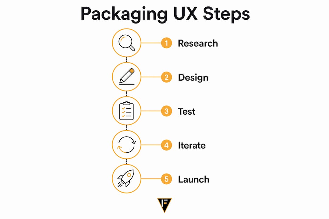
What are best practices for enhancing user experience through packaging design?
The most effective packaging UX strategies share one characteristic: they are tested against real consumer behavior, not assumed from design intent. UX packaging failures most often emerge in the gap between what designers intend and what consumers actually experience when opening a product at home, in a car, or with one hand occupied.
Simplification is the highest-return investment most brands can make. Research shows that 35% of consumers would buy more often if packaging were simpler, 22.3% would recommend the brand, and 14.7% would switch from a competitor. Simpler packaging is not about stripping away design. It means removing friction from every interaction point.
Connected packaging adds a digital layer that extends the user experience beyond the physical object. QR codes, NFC tags, and micro-instructions give brands a way to deliver updated usage information, traceability data, and accessibility content without cluttering the physical label. Accessible connected packaging requires careful placement of digital elements and clear calls to action. A QR code buried on the bottom panel with no context will not be scanned.
The following practices consistently produce measurable improvements in packaging usability and consumer satisfaction:
- Conduct human-factors testing with representative users, including older adults and people with physical limitations, before finalizing structural design.
- Eliminate tool dependency by replacing clamshells and wire ties with tear strips, pull tabs, and push-button mechanisms.
- Place critical information in visual hot zones and verify readability at actual print size and under typical retail or home lighting.
- Use transparent windows or panels where product visibility increases purchase confidence, particularly for food, supplements, and beauty products.
- Integrate QR codes with clear context labels so consumers understand what they will find before scanning.
- Test the custom packaging design for your brand against competitor packaging in a blind usability study to identify relative strengths and gaps.
Pro Tip: Ask five people outside your company to open your packaging without any instructions and describe what they're doing out loud. The hesitations and workarounds they verbalize are your redesign brief.
Key takeaways
Packaging UX drives customer satisfaction, brand loyalty, and repeat purchases when it integrates protection, usability, visual clarity, and sustainability into a single, tested design system.
| Point | Details |
|---|---|
| Functional usability is non-negotiable | 78.8% of consumers need a tool to open packaging, and frustration directly damages brand perception. |
| Visual clarity requires more than prominence | Label readability must meet perceptual thresholds; prominent text that fails contrast standards is noticed but not understood. |
| Sustainability and UX align | 86% of consumers expect sustainable packaging, and right-sized design improves both eco outcomes and the unboxing experience. |
| Simplification drives loyalty | 35% of consumers would buy more often if packaging were simpler, making usability a direct revenue lever. |
| Cross-functional design produces better outcomes | Integrating UX, logistics, and sustainability teams from the brief stage prevents costly late-stage redesigns. |
Packaging UX is a strategic decision, not a design afterthought
I've reviewed hundreds of product launches where the formulation was excellent and the marketing was solid, but the packaging created friction that quietly eroded customer retention. The brand never connected the dots because returns and negative reviews rarely cite "hard to open" as the explicit reason. They just don't reorder.
What I find most underappreciated is how much packaging UX functions as a proxy for brand quality in the consumer's mind. A supplement in a beautifully formulated bottle with a cap that requires two hands and a firm grip signals something about the brand's attention to detail, and not something positive. Consumers don't separate the product from the package. They experience them as one thing.
The shift I'd encourage every brand to make is treating packaging usability testing the same way you treat formulation stability testing. You wouldn't release a product without confirming it performs under real conditions. The same standard should apply to the container it comes in. The brands winning on formulation transparency and ingredient clarity are already ahead on label design. The next frontier is making sure the physical interaction matches the trust that transparency creates.
AI-driven packaging optimization, the kind Amazon is already deploying at scale, will reach mid-market brands within the next two years. The brands that have already built usability testing into their development process will adopt those tools faster and more effectively. The brands that haven't will be optimizing a broken baseline.
— Ben
How Formlypro helps you build packaging that works
Packaging UX doesn't exist in isolation from formulation, compliance, and brand positioning. Formlypro's platform connects all of these into a single workflow, so you're not making packaging decisions without knowing your formulation constraints or regulatory requirements.
The platform's AI Mockup designer lets you build and iterate on custom packaging designs directly within the same system where you're managing your formulation, compliance documentation, and market research. That means your packaging decisions are informed by your product data, not made in a separate tool with incomplete context. Formlypro's 8-phase product development plan takes you from ideation through production, with packaging as an integrated phase rather than a final step. If you're building a new product or rethinking an existing one, explore Formlypro to see how the platform supports every stage of that process.
FAQ
What is the role of user experience in packaging?
User experience in packaging covers every interaction a consumer has with a product's container, from opening and using to disposing of it. It directly affects brand perception, customer satisfaction, and repeat purchase behavior.
How does packaging affect consumer perception of a brand?
Poor packaging usability leads 70.6% of consumers to associate the brand with low quality or lack of care, according to a survey of 1,000 U.S. adults. Packaging is often the first physical signal of brand standards.
What makes packaging user-friendly?
User-friendly packaging opens without tools, communicates clearly through readable labels, protects the product reliably, and meets sustainability expectations. Inclusive design validated through human-factors testing, like the Arthritis Foundation's Ease of Use Certification, sets the highest standard.
How does sustainable packaging impact user experience?
Sustainable packaging and positive user experience are compatible when designed together from the start. Right-sized, lightweight, recyclable packaging reduces waste and typically improves the unboxing experience by eliminating excess void fill and unnecessary complexity.
How can brands improve packaging usability quickly?
The fastest improvements come from eliminating tool dependency, adding tear strips or pull tabs, and testing the package with real users before production. Research shows that simplifying packaging increases repeat purchase intent for 35% of consumers.